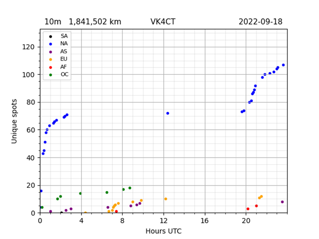
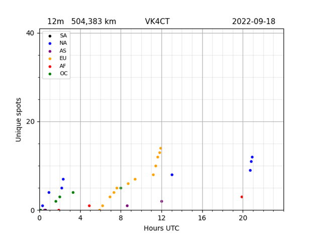
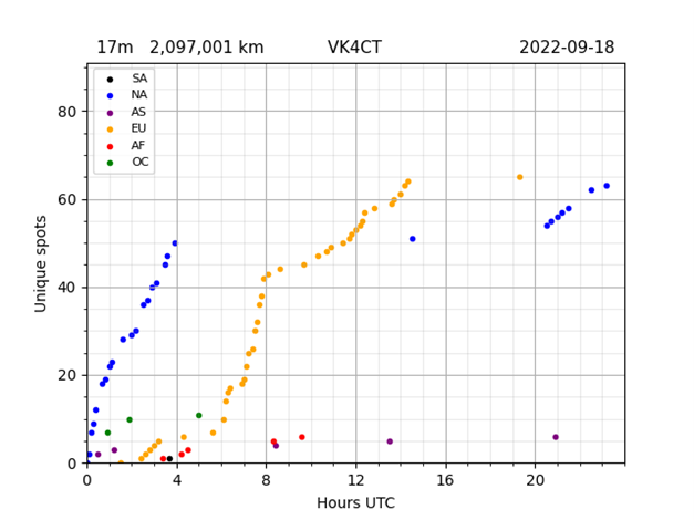
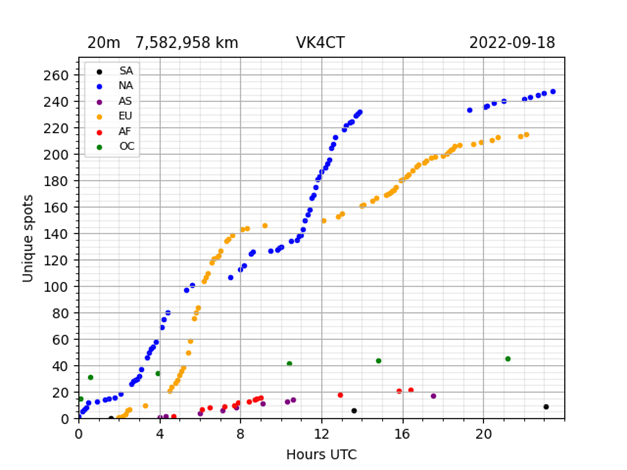
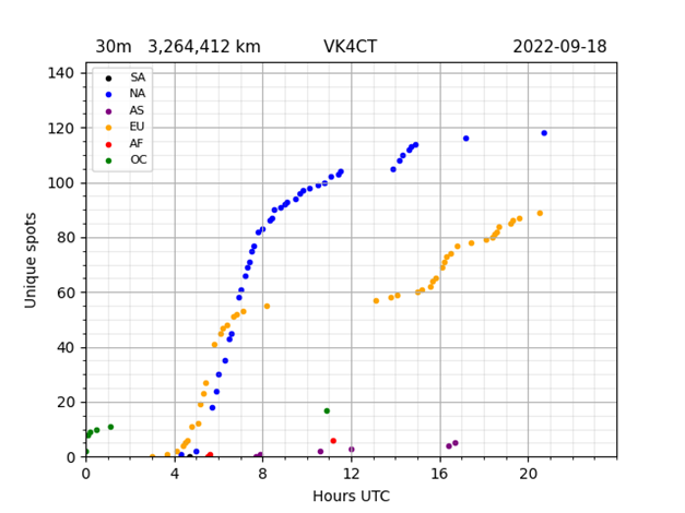
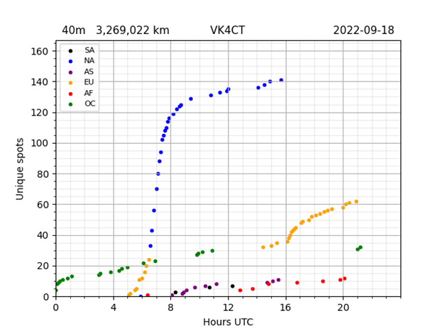
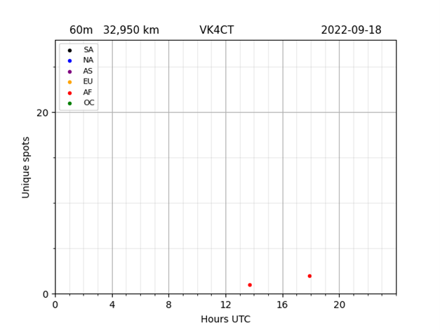
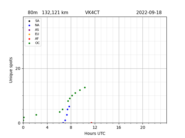
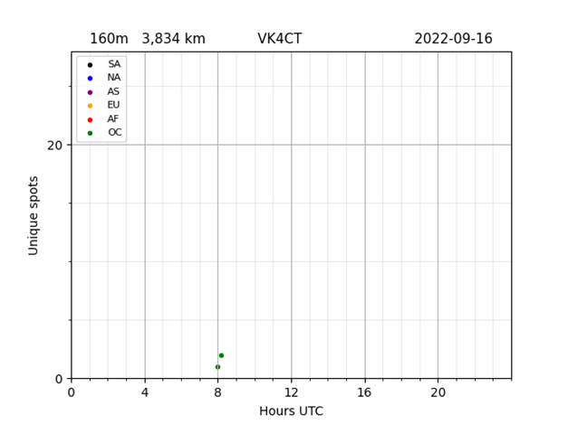
HF band openings can be tracked in different ways. Weak Signal Propagation Reports (WSPR) provide a useful way of tracking band openings.
The table below contains links that chart HF band openings – based on analysis of weak signals transmitted by amateur radio stations. We will continue to add more bands and more reporters. Keep watching this space.
Updated 2021-01-24
HF band openings from Germany to Australia
As an example, the chart below tracks 40m HF band openings for radio communication from Germany to Queensland Australia.

Description
Each dot on the chart above represents a weak signal transmitted by DF2UU in Germany and received by VK4CT near Brisbane Australia.
In this case, spots grouped on the left-side represent signals received on the long-path bearing 246 degrees from Germany to Brisbane. Spots grouped on the right-side represent signals received along the short-path bearing 64 degrees from Germany to Brisbane. Signal strengths correlate with the sun’s solar activity. The strongest signals generally occur during dawn and dusk along the grey line.
The sample chart shows that during seven days ended 2021-Jan-19, the 40m band opened for 1.5 hours on the long-path and six hours on the short-path.
The chart demonstrates that signal to noise ratios vary by about 17dB on the short-path and about 20 dB on the long-path.
Applications
The charts are useful for a variety of applications – including: contest planning and station comparisons.
Contest planning
A plan is essential for competitive performance. Knowing the best band opening times helps to prepare for opportunities when they arise. The alternative is to miss narrow windows to valuable openings. The charts show the best times to work any continent on any HF band.
A plan can be easily mapped on a one page spreadsheet. That sheet is enough to guide the operation. Label each row with the UTC hour down the left column. Label each column with bands along the top row.
Mark cells with band openings using continent abbreviations – AF, OC, SA, NA, AS and EU.
For further refinement add colour highlights to your high priority cells.
Station comparisons
Select two reporters that you would like to compare – typically on the same band and located close by. Then open two browser windows side-by-side on the same screen. Use the first browser to open charts for the first reporter’s callsign, and use the second browser to open charts for the second reporter’s callsign. Scroll through the charts to compare spots received and reported by the stations being compared.
There is no limit to the number of browser windows open at the same time. This is useful for comparing more than two stations.
Have fun
We hope you enjoy an educational journey while browsing through the charts. You might like to test your knowledge of radio wave propagation by doing the exercises at bottom of each set of charts. Chances are that you will find your own call-sign in the charts 😉
Enjoy!